Project Description
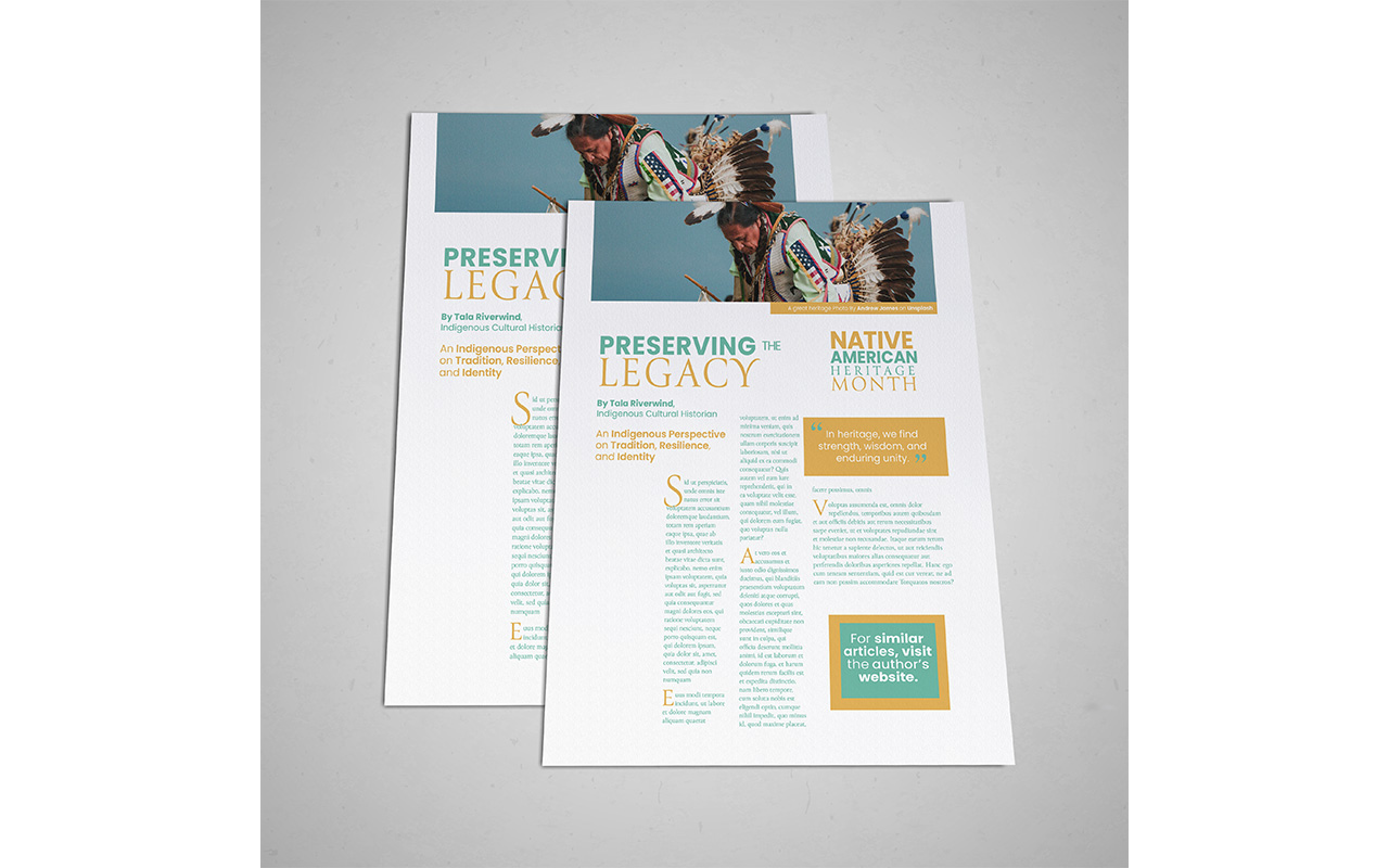
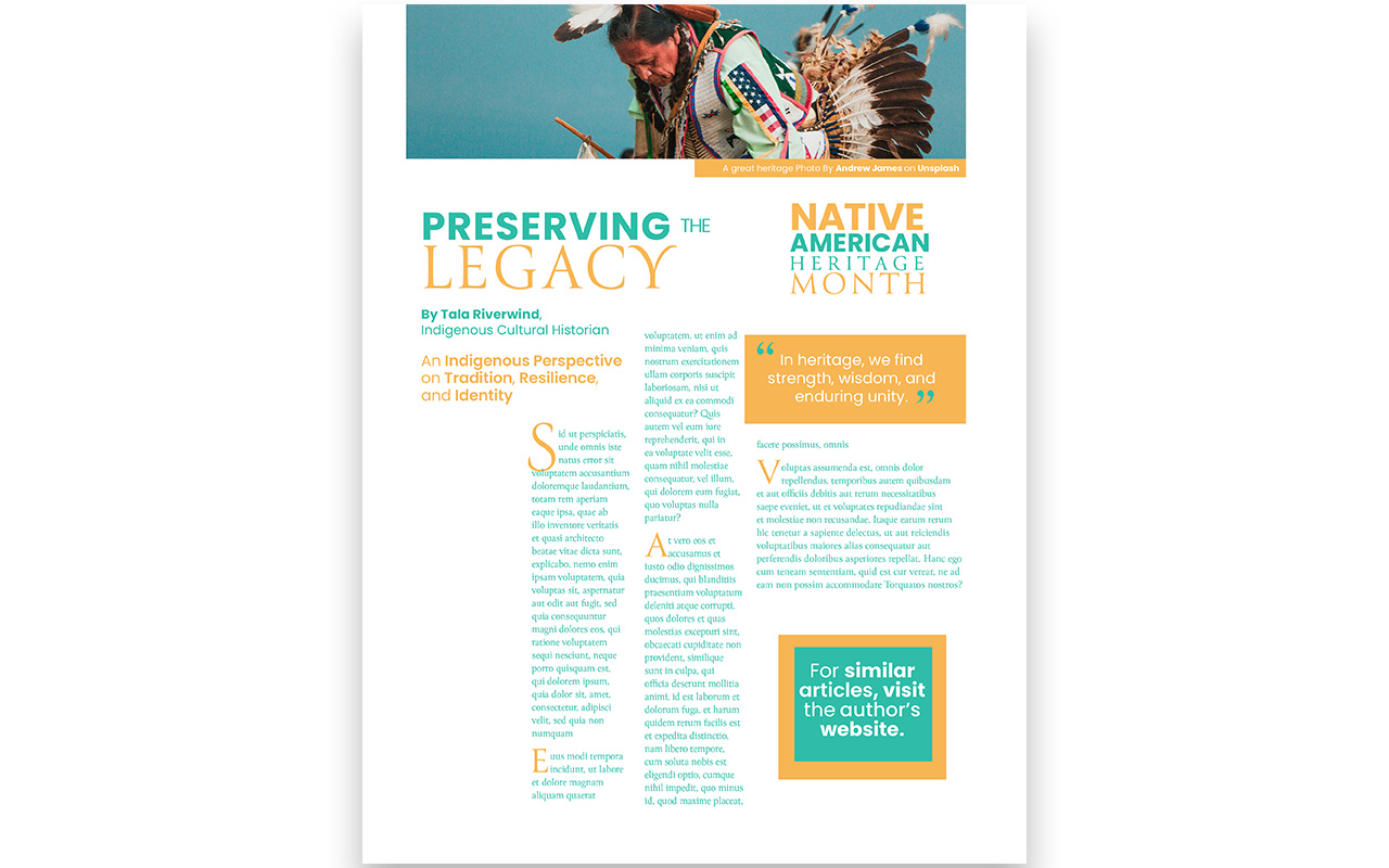
Typography selection in design is crucial for effective communication with a specific audience. My magazine design uses two typefaces: Poppins and Canto. Poppins, a clean and legible sans serif, conveys modernity and legibility, making it ideal for body copy. Canto, with its contemporary look, enhances legibility and readability throughout the copy.
Inspired by nature and modern culture, I chose a vibrant green and blue tint to highlight these themes. Gold and yellow accents symbolize the sun’s significance in Native American culture and attract a younger audience. Repetition and negative space emphasize pull quotes and a call to action, while asymmetrical balance balances typography and graphical elements.
My design features a single modern and artistic image of a Native American man with a bright green background, contrasting with the green throughout the design. This image stands out from common black-and-white photography of Native Americans in natural settings. It appeals to a young demographic with its contemporary and modern aesthetic. The clean sans serif typography, bright and bold color palette, and minimal images align with the target audience. I prioritized color, typography, and imagery during the design process to achieve cultural richness, a modern look, and a vibrant color palette. Overall, I successfully met the client’s expectations.
