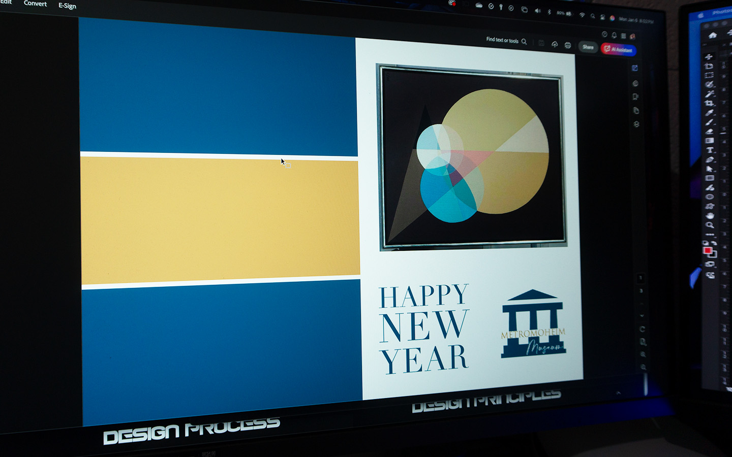
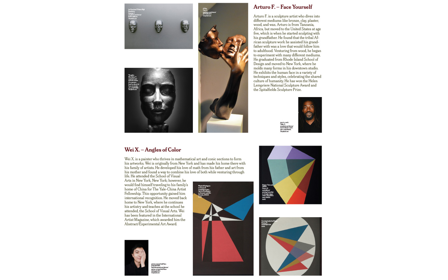
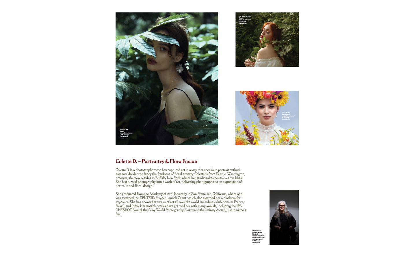
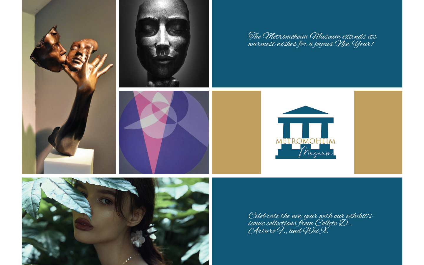
Hierarchy is used in identifying what is most important within an image. An example of how it is used is by creating order and dominance by using larger or bolder fonts. Balance provides stability and structure to a design. By using the placement of objects, you can create a symmetrical or asymmetrical balance to use contrast to even out objects in a design. You can use objects to replicate blocks to demonstrate weight. Creates consistency and organization in an image. Font, line, color or size are some examples of how to express this principle and can unify individual objects strengthening the overall design with a sense of unity. Unity is the sense of harmony and cohesion among the elements of design. Variety creates interest by using contrast with different shapes, sizes or textures.
Unity is the wholeness of elements of design working together in harmony. Unity can be achieved with alignment, repetition, hierarchy and proximity. Variety is the quality of diversity that is achieved when the elements are varying. Shape, color, texture, scale and proximity can be utilized to create variety within a composition. Contrast highlights and emphasizes specific objects in a design. Contrast is using opposing elements values to attract and create attention. Contrast guides the viewer’s eyes to the most important part of the image. Proximity creates a relationship between objects.
This principle is not objects being grouped as one, instead it is that the elements are visually connected and create cohesion. Proximity provides a focal point by creating a center of interest. Scale refers to the size of an element in relation to another element. It is the balance or ratio of an element to the composition. It can be achieved by creating a contrast and hierarchy or communicate other ideas. An example of scale can be varying the sizes of the fonts to create hierarchy and contrast to guide the viewer’s eye.


