Project Description
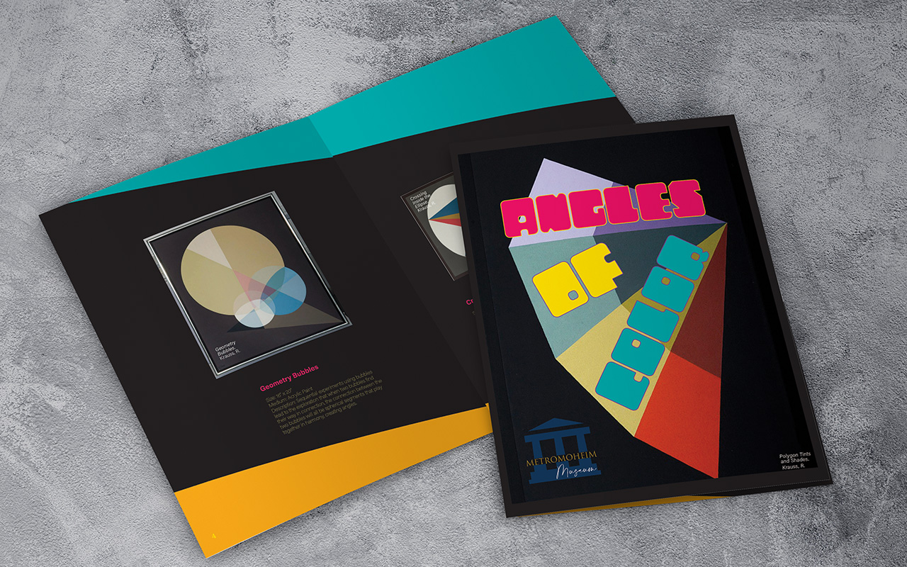
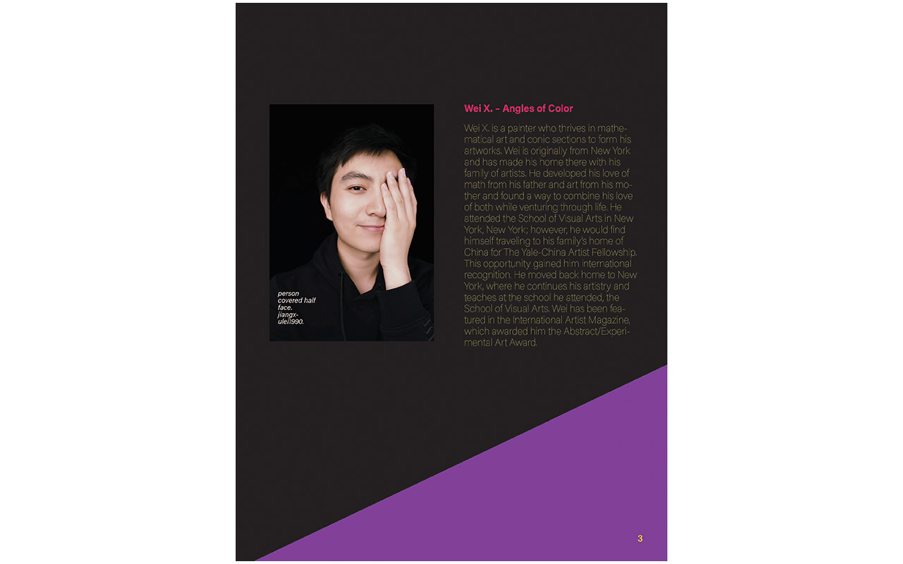
I chose a double-column grid to meet the design needs of the museum catalog. The double-column grid helps with delivering the content in the most understandable and immediate manner due to its structure of visual fields. This grid also provides balance regarding the design elements and unifies the information for the viewer.
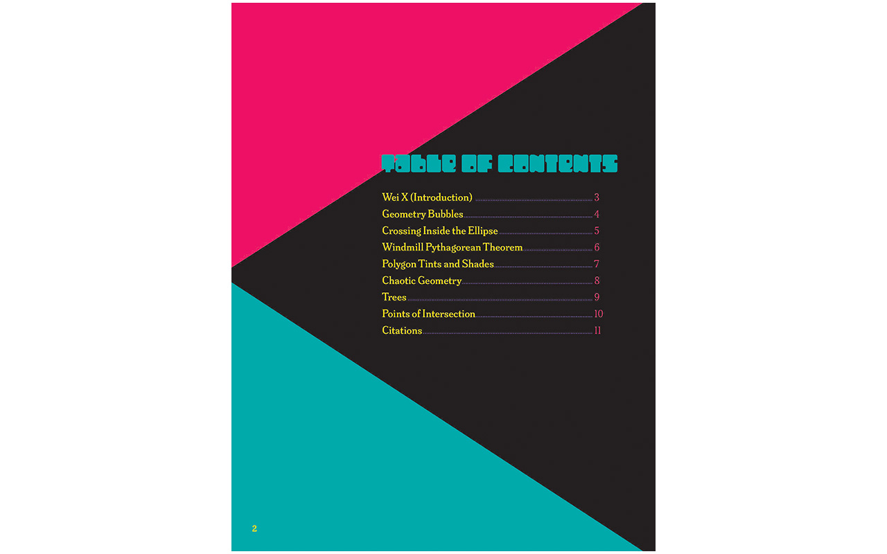
Visual hierarchy is greatly enhanced with the double-column grid as it has the structure for organizing images and text with flexibility and symmetry. The columns have equal width, but two columns perfectly measure the page and give the ability to resize images proportionally to increase scale and create hierarchy. The subject matter is easily understood and gives the viewer a single focus and reducing eye strain and increases the space and enhances the layout by letting the page breathe.
The composition techniques I considered when choosing the grid structure changed from my initial ideas. At first, I wanted to use a modular grid like the ones I used in the past couple of modules, but I decided that in order to create more visual interest and hierarchy in my design elements, it was better to use a grid system that has plenty of space to arrange images and text in a way that isn’t too distracting and visually busy for the reader. I created the grid structure with the golden ratio in mind to organize the proportions of images and text.
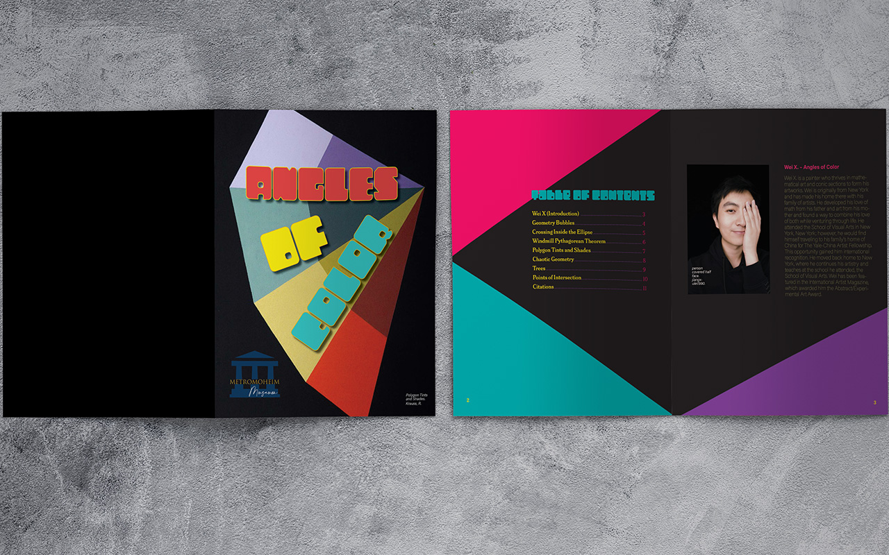
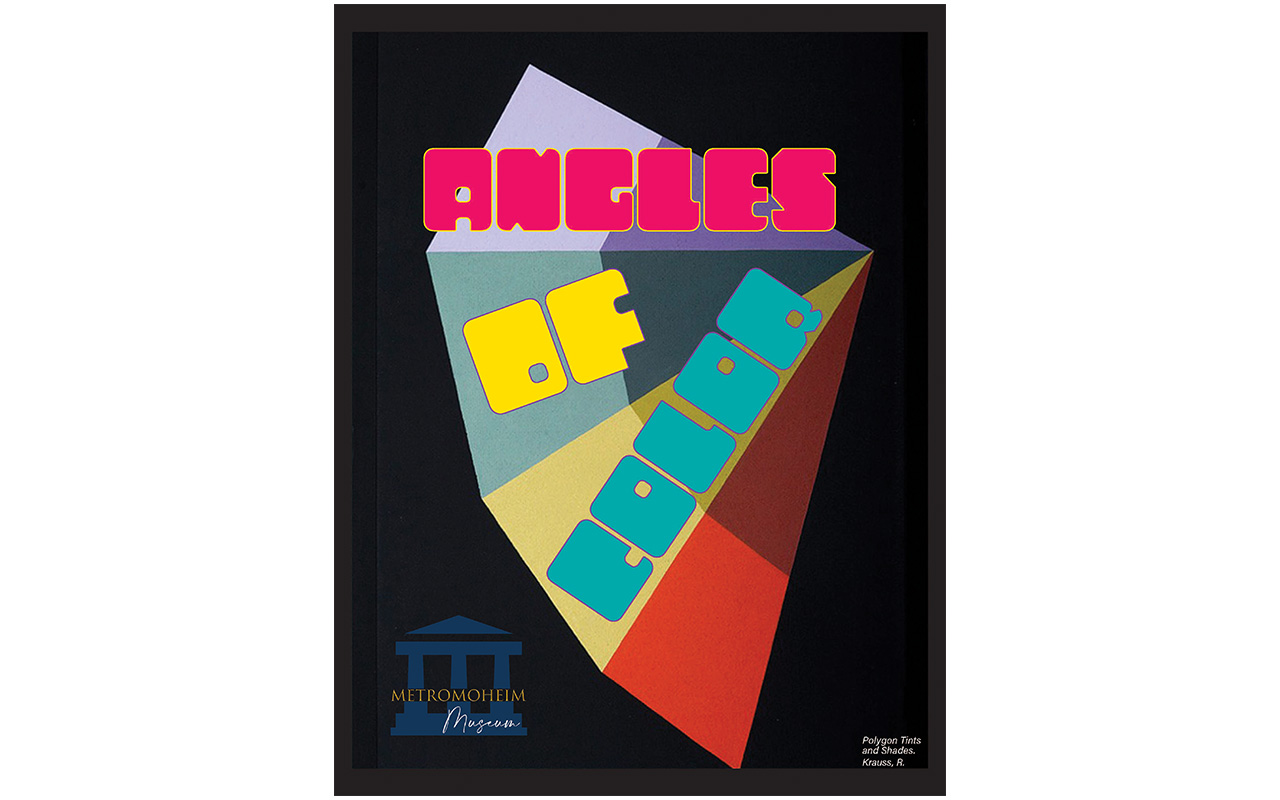
My goal was to utilize the elements and principles of design to create an effective layout composition in my catalog. I wanted to focus on contrast, hierarchy and direction to present the content. In my cover page, I used the name of the collection, “Angles of Color” as the focal point to give a sense of direction and arranged the text skewed in an angle and utilizing alignment to line up the text with the image in the background. I used repetition and color with the theme of angles of color throughout the different pages of the catalog. I applied balance in the text and images in the collection with the double-column grid system to present the information that is clear and easy to digest. I applied space throughout the catalog to give the text and image elements breathing room and made them easily identifiable by the viewer.
