The elements and principles used in my artifacts that are effectively utilized are line, color, space, contrast, hierarchy and scale. The hierarchy of the information provides a focal point starting from the headline going down. The color and size of the text and background contrasts to create a focal point for the viewer. This [...]
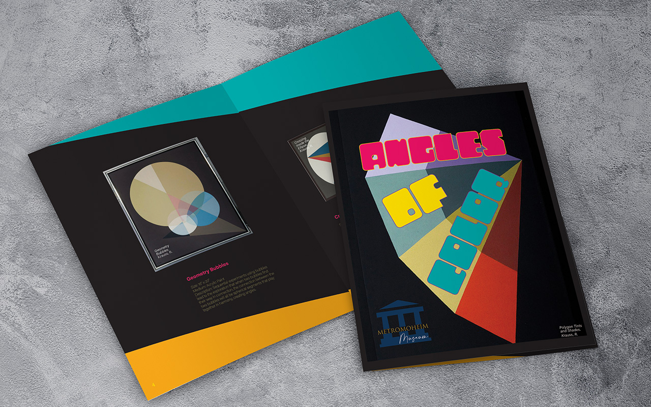
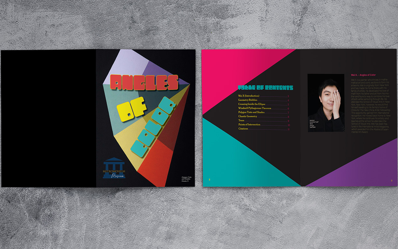
I chose a double-column grid to meet the design needs of the museum catalog. The double-column grid helps with delivering the content in the most understandable and immediate manner due to its structure of visual fields. This grid also provides balance regarding the design elements and unifies the information for the viewer. Visual hierarchy is [...]
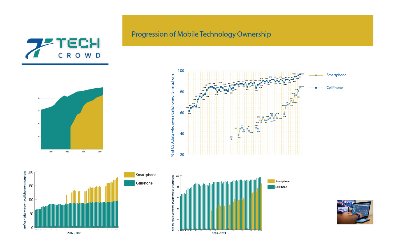
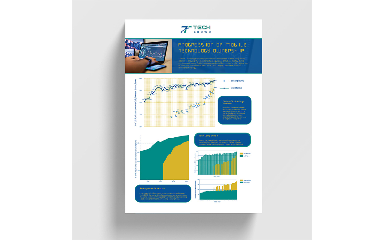
This graphic is the progression of mobile technology ownership. The aspects of the data that I will focus on include the dates and of course the percentages of the adults who own a smartphone. I want to show the relationship between the ownership of smartphones and the timeframe where this trend began. The intended [...]
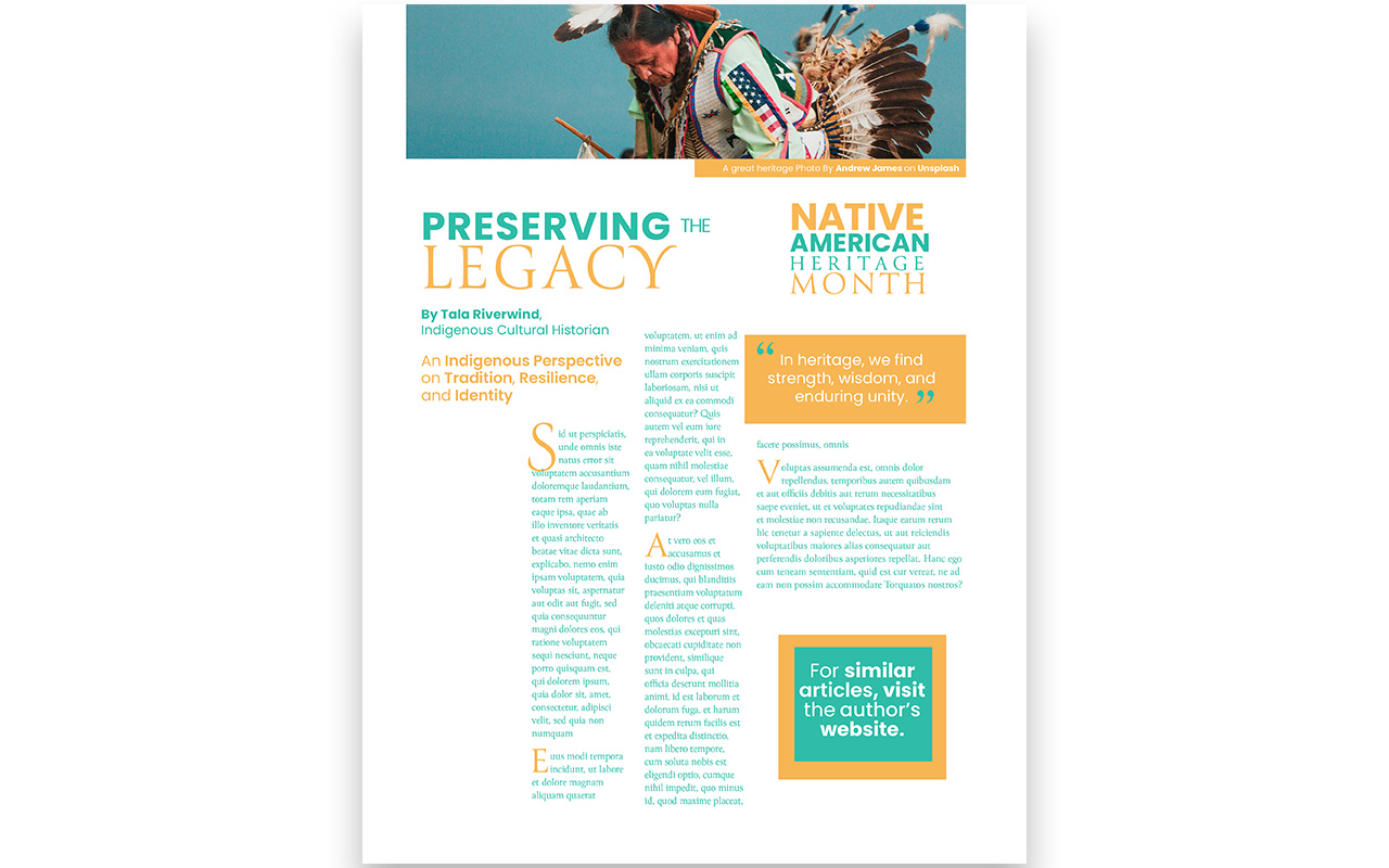
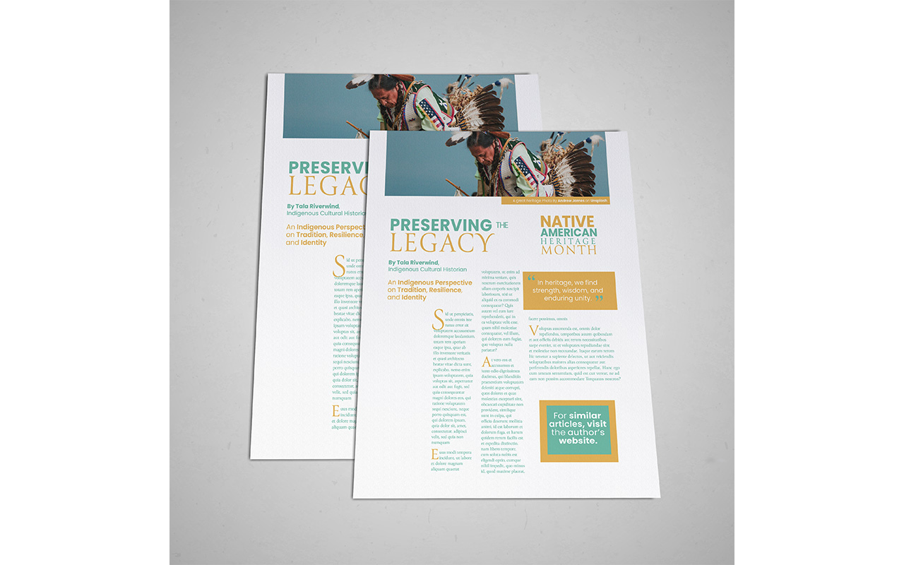
Typography selection in design is crucial for effective communication with a specific audience. My magazine design uses two typefaces: Poppins and Canto. Poppins, a clean and legible sans serif, conveys modernity and legibility, making it ideal for body copy. Canto, with its contemporary look, enhances legibility and readability throughout the copy. Inspired by nature [...]
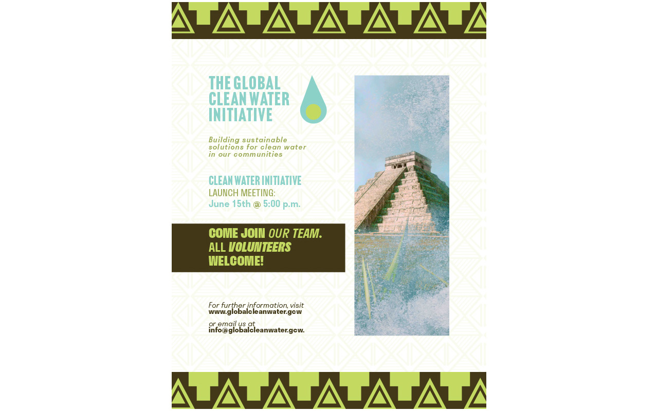
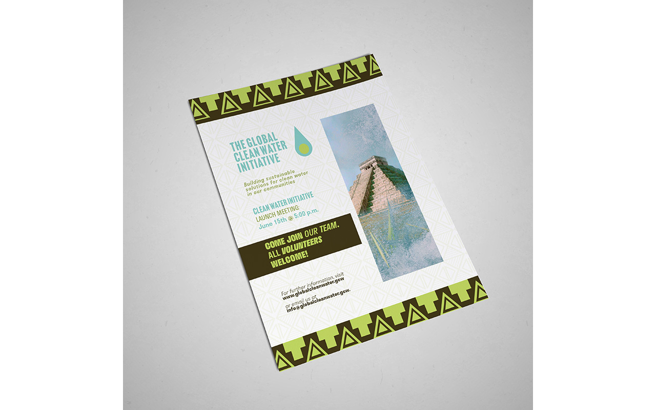
The goal of the project is to design a call to action flyer for a launch meeting for a clean water initiative. The initiative is for global access to safe water. The Gloabal Clean Water Inititaive is committed to the environment and seek to make a strong impact on communities and preserving their environments. [...]
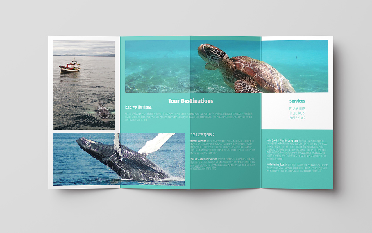
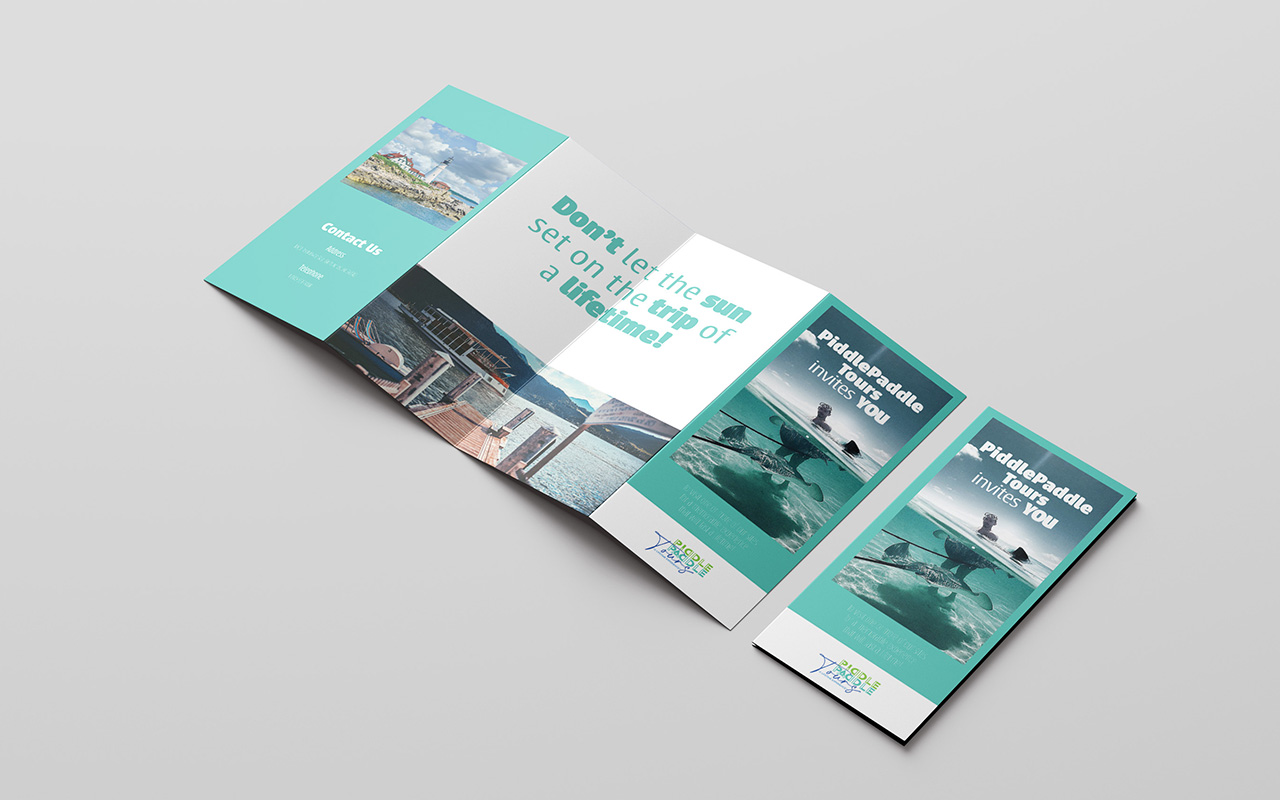
The pagination of my Z-fold brochure has the cover page and the back panels of the brochure all on one side of the document while the interior panels contain the main content such as tour destinations and services. The sequencing begins with the imagery as the largest element which grabs the viewer’s attention. The text [...]
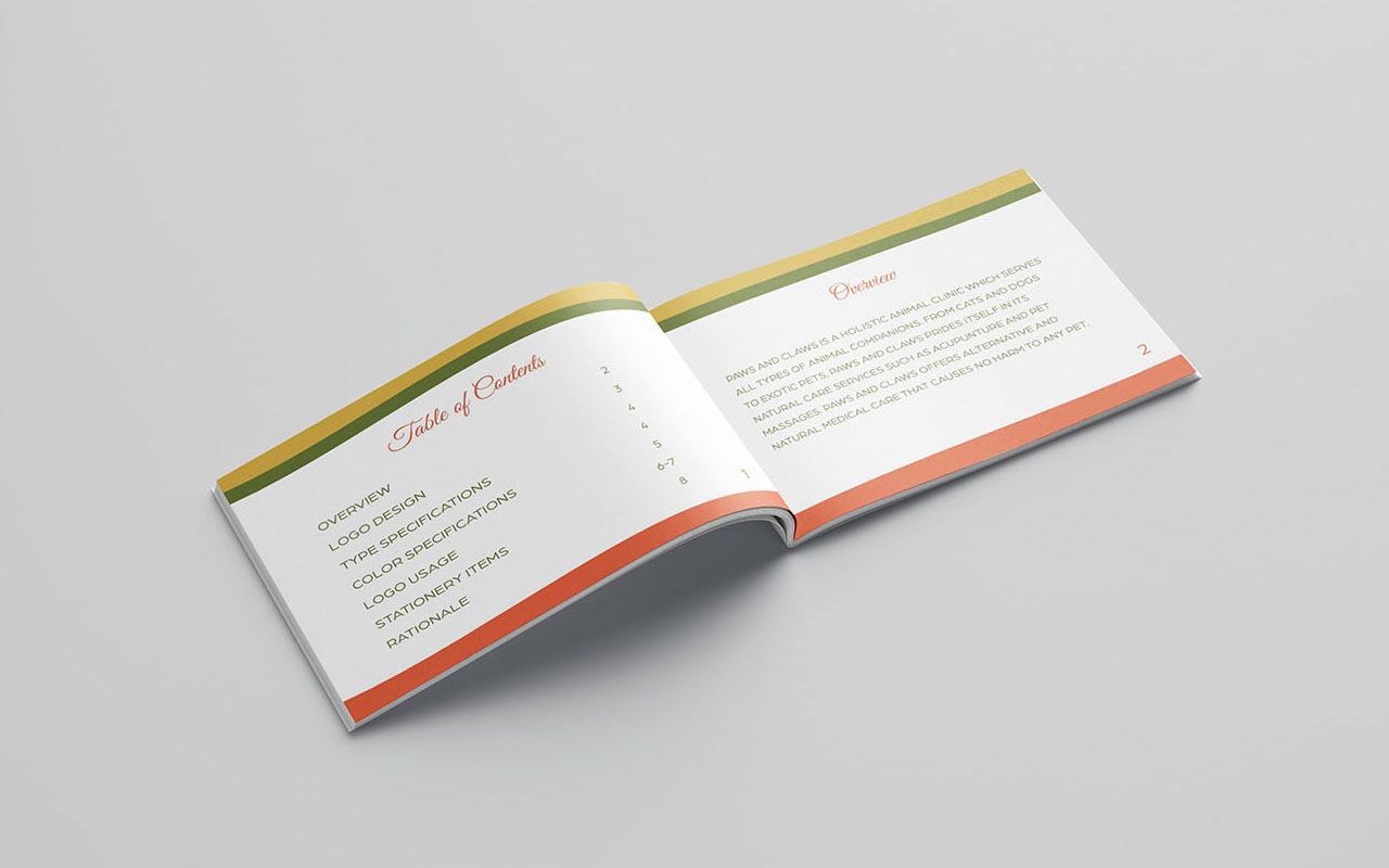
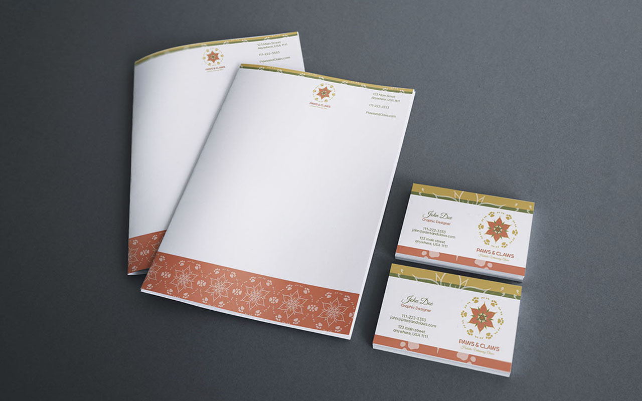
PAWS AND CLAWS is a holistic animal clinic that cares for all kinds of animal companions, from cats and dogs to exotic pets. They’re known for their natural care services, like acupuncture and pet massages. PAWS AND CLAWS offers alternative and natural medical care that’s safe and effective for all pets. PAWS AND CLAWS [...]
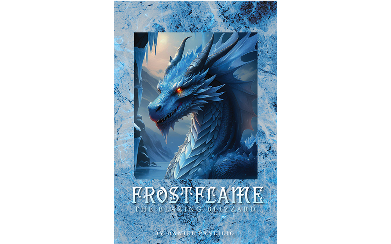
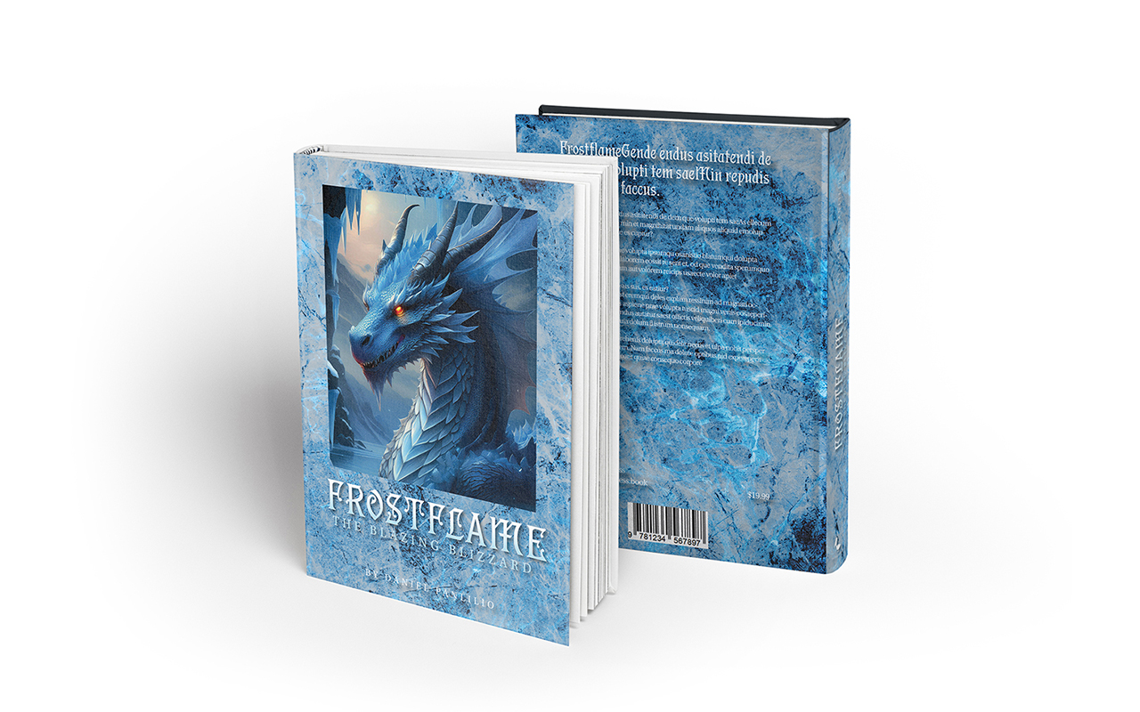
My proposal for selecting typefaces is based on the theme of the story of the fan fiction novel. Using design thinking, I concluded utilizing Jana Thork, Dejanire, Tacitus, Rocky, Pentz and Utopia as the typefaces for this project.
PortfolioDaniel2025-02-10T09:05:23+00:00
